Get in touch
555-555-5555
mymail@mailservice.com
602-625-2260
1-646-504-2338


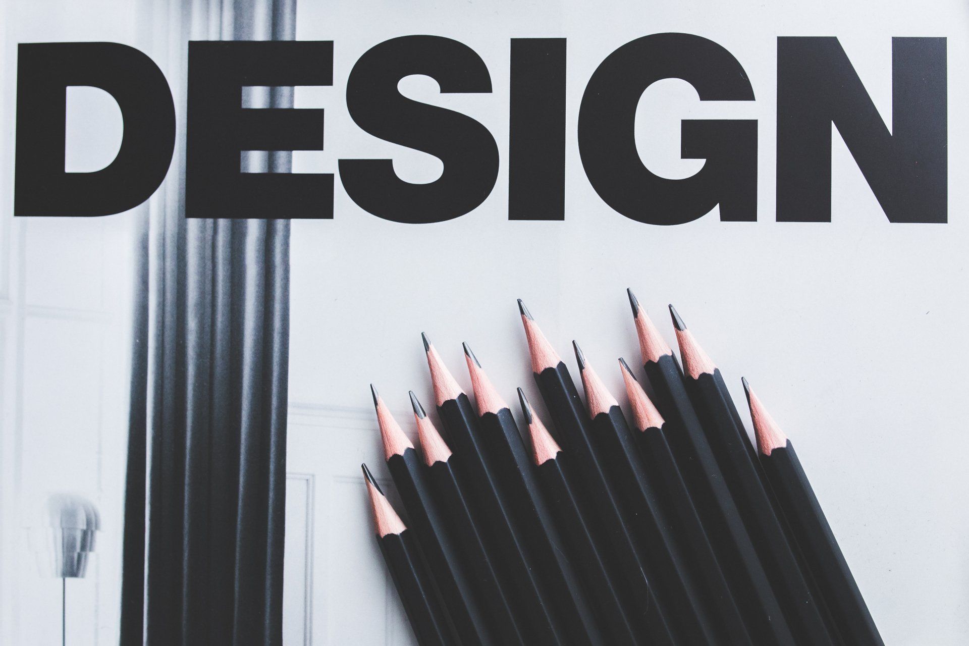
How Good Design improves your website and your business
Next to images, graphics and other design elements, fonts are the next most important element that will shape your design. Understanding how to use fonts correctly could be a turning point of any design. Since fonts and type are so crucial to good design, I’m going to cover the most common font mistakes I see non-designers make when designing graphics, pdfs, Pinterest pins, freebies and social media graphics for their blogs. What better way to learn how to properly use fonts than to determine exactly what mistakes to avoid when working with them? Font Mistake #1: Using Hard to Read Fonts One of the biggest mistakes that can be made as a designer is to make your readers WORK to get your message. It is our job to design in a way that is quickly received and understood immediately. So along with your images and other elements, make sure your fonts are readable! If you can’t read them at a glance, choose a different font. This is especially important when designing things like social media graphics and Pinterest Pins. If anyone has to squint their eyes to read what you have to say, they are going to look right past you. Instead, choose fonts that are clear and legible. When selecting fonts for your brand and graphics, you want to make sure that you will be able to use them in a variety of ways. Will they catch a potential reader as they are scrolling through their Pinterest feed or Facebook? You want them to be eye-catching enough so that people notice you, but you don’t want to take it too far. Find a happy middle ground and hang out there. Font Mistake #2: Using Too Many Fonts I know, I know, with THOUSANDS of fonts available, it’s tough not to want to use them all. Do yourself a favor and stick with no more than two to three different fonts. Instead, pick two to three fonts that you always use and stick to them! You will be amazed at how easier it is to design when you don’t have to go searching for new fonts for every project. This will also amplify your brand and help others notice you online. You want your brand to have one personality, and you want people to start to feel like they know you. If you show up with a different mask on all the time, you’ll continue to be the “new kid on the blog. Font Mistake #3: Not Arranging your Fonts Correctly Have you ever been shoulder to shoulder with a group of people? It’s not fun. The same thing goes for type. Not leaving enough white space around your text results in a cluttered design that is hard to connect with, and harder to read which means your readers will just keep on scrollin’. Make sure to leave adequate spacing along the edge of your design and between text. Be consistent! Along with spacing, poor alignment can ruin your design. Put a laser focus on making sure all of your written and visual elements are aligned left, right or center. Use a grid instead of placing text wily-nilly in your design. When aligning text, draw an invisible line to make sure your alignment is on point. I know what it’s like to want to fill that awkward space, but rest assured – you don’t have to! White space is a good thing and will help your readers understand your messaging quicker. Font Mistake #4: No Hierarchy It’s easy to get this one wrong. There should always be one focal point of your design that you want your readers to notice right away. Without visual hierarchy, your readers won’t know where to look or what you’re trying to convey. You want to catch your readers with eye-catching words that they can relate to. If your blog post is titled “How to Start Your Business as a Working Mom,” you’d want to catch moms who are looking to Start a Business. Put the attention on those words by making them a different color, a bolder font or much larger than the rest. You can see this in Font Mistake #4: Using All Caps on Script Fonts Script fonts are pretty, functional and have the potential to create a one of a kind personality for your brand. But I see them being used completely wrong all the time. It makes my eyes hurt. You never, ever want to use a script font in all caps. When you use script fonts in all caps, they are extremely hard to read because they are not designed to be used that way. Remember what I said about making people work to read your message? Using script fonts in all caps will scare people away. Font Mistake #5: Using Fonts That Don’t Convey the Right Meaning When it comes to choosing a font to use, pick ones that match the vibe and set the tone for your audience. At first glance, the fonts that you choose will give your readers a specific feeling. Your goal is to make your image as easy for them to understand and you don’t want them to have to overthink or be confused! If someone sees an image for a Disney Vacation, you want to use fonts that portray fun, magical and excitement. Likewise, if you’re looking for fonts to use with an image about time management, you’d want fonts that look organized and strong. Be choosy when looking for the perfect font. If you don’t nail it, you risk confusing your readers and causing unnecessary distraction! Font Mistake #6: Using Fonts That Everybody Else Is Using You want to stand out, right? Standing out means having your own set of fonts that are unique to you and your brand. When choosing fonts, it’s easy to look at what others are doing and want to do the same. But doing that only has the potential to hurt you because you won’t stand out! You’ll risk looking like someone else. It’s okay to get inspiration from others, but when it comes down to it, avoid using the same fonts as someone else. Font Mistake #7: Using Fonts That Are on the “Never Use” List Comic Sans. Need I say more? I think everyone knows not to use Comic Sans unless you are designing a flyer for a preschool, a lemonade stand, or a COMIC BOOK. And even if you do happen to design for a preschool, there are so many other fonts you can use instead. Aside from Comic Sans, there are a handful of different fonts that have run their course and need to be retired. These include, but are not limited to, Brush Script, Trajan, Papyrus, Pacifico, Lobster, Bradley Hand, and Bauhaus. These fonts aren’t terrible, but their misuse has unfortunately ruined them forever.

When people think about your business or organization what is it that comes to mind? Do people perceive your business in the way you want them to? If not, take time to examine your brand identity, the first line of communication between you and your customers. If you haven't pondered these questions yet, wait no longer! Brand Identity combines different visual and sensory elements and works as a strategic tool to build recognition, broadcast your message, communicate your values, and express what sets your business apart from the others. If this seems just a little confusing let me just clarify by giving you a couple of easy examples from the music industry. When you think about the band KISS, what comes to mind? Painted faces, platform boots, metal and leather, the iconic logo. Their brand is distinct, powerful and unmistakable. Another great example is Daft Punk, the electronic music duo. Their space-age helmets and futuristic sci-fi style are synonymous with their brand. Even the fact that they maintain a certain anonymity behind the helmets is part of their brand. All of these things together set a very specific and intentional mood or atmosphere around these performers and their music. In the same way your business should communicate to its fans or customers. What is the purpose of your brand? Brand purpose is the reason for your brand to exist beyond making money. The purpose of your brand needs to relate directly to its products or services. To understand the purpose of your brand, you should know your core brand values, mission statement, and value proposition. Be clear about what makes your brand unique or why people should choose to do business with you. A well-thought-out brand purpose must have the customer in mind at every step. Remember, your end goal is to connect with customers emotionally, to make your brand a more desirable selection. The first step is to target your audience. Who are you trying to reach and why? Different people want different things. You can't target a product to people in their 20s the same way you would target a product to ones in their 30s. You must research as much as you can to know what your target audience would want from your brand. Based on your target audience, you can create a brand voice that can directly target them. The best brands speak with one distinctive voice. On the web, in a tweet, in conversations with a salesperson, in a speech given by the president, your brand must project the same voice and unified message. Whether it is a call to action or a product description, language must be vital, straightforward, eloquent, and meaningful. Be sure the meaning is accessible to all customers. When developing key messages and brand descriptions, you must preserve the impact by keeping them unique yet simple and easy to understand. Your brand messages will work well if they refine the essence of your product or service. Create sample templates for frequently used messages, social media copies and emails. A strong visual identity comprises all the visual elements of your brand. The most important ones are the logo, color palette and typography. These are the "clothes", so to speak, of your brand. They're your organizations style. Your logo is the forward face of your brand. It must clearly convey what your brand stands for. A good logo should be simple, memorable, timeless, versatile and appropriate to your brand. It should stand out among your immediate competitors as well as the common visual language of your industry. Since your logo will appear everywhere your audience interacts with your brand, it's very important that it looks good wherever it's placed. The color palette you use will evoke emotion and express the personality of your brand. The brain reads color before it reads the content. A study shows that people make a subconscious judgment about a product within the initial 90 seconds and between 62% and 90% of that assessment is based on color alone. You must choose your colors wisely as your print accessories, website colors, social media graphics and everything else will follow these brand colors. Typography is a core building block of an effective brand identity. Brands like Apple, Zara and Vogue are immediately recognizable due to the distinctive and consistent typographical style they use everywhere. There are many options to choose from the four basic fonts groups: Serif, Sans Serif, Script and Display fonts. Just like your brand colors, make sure to choose 1-3 fonts and consistently use the same fonts everywhere. Choose a typeface that is flexible and easy to use. Clarity and legibility are the drivers. All of these elements of brand identity will fit together and position your brand where you want and need it to be. Understanding the importance of brand identity as the outward face or your organization is the first step. Managing and cultivating your brand identity into the future will be the next important part of the process. Don't be afraid to get the help of a professional when you need it. Brand identity is an important element in communicating to the the world and should not be neglected!
Your business has a personality. Have you ever thought about that? just like a person every organization is an entity with a unique character...its brand identity. If you've pondered this concept at all you may have thought it belongs solely in the realm of big corporations with marketing departments but that's far from the truth. In fact, I would say that the smaller the organization is the more it's brand identity shows. And smaller businesses having fewer resources must be more attuned to how their brand communicates to customers. Knowing what feelings a customer gets when thinking about your business and how to communicate through them is imperative. Which brings us to visuals and social media. Your social media account, whether Facebook, Instagram, Pinterest, or whatever, is a platform to tell a story. You communicate that story or narrative through the voice of your brand identity. What does that mean? Let's say your business is a vintage clothing shop. Your store's personality traits could be described as funky, fun, eccentric, eclectic, and historic. These traits get translated visually through color, imagery, your company logo, font styles and other visual elements. For the most part your personality traits aren't going to change so you'll want to maintain a certain degree of consistency in the visual elements you use in your posts. There could be some variation depending on the individual story being told at any given time on your social media page but some things should always remain consistent. Imagine showing up to a friends house looking and acting completely different every time; that would be pretty confusing and the same is true of your brand identity on social media. When your businesses personality is known and consistent you can communicate to your customers without confusing them.
How Good Design improves your website and your business
Next to images, graphics and other design elements, fonts are the next most important element that will shape your design. Understanding how to use fonts correctly could be a turning point of any design. Since fonts and type are so crucial to good design, I’m going to cover the most common font mistakes I see non-designers make when designing graphics, pdfs, Pinterest pins, freebies and social media graphics for their blogs. What better way to learn how to properly use fonts than to determine exactly what mistakes to avoid when working with them? Font Mistake #1: Using Hard to Read Fonts One of the biggest mistakes that can be made as a designer is to make your readers WORK to get your message. It is our job to design in a way that is quickly received and understood immediately. So along with your images and other elements, make sure your fonts are readable! If you can’t read them at a glance, choose a different font. This is especially important when designing things like social media graphics and Pinterest Pins. If anyone has to squint their eyes to read what you have to say, they are going to look right past you. Instead, choose fonts that are clear and legible. When selecting fonts for your brand and graphics, you want to make sure that you will be able to use them in a variety of ways. Will they catch a potential reader as they are scrolling through their Pinterest feed or Facebook? You want them to be eye-catching enough so that people notice you, but you don’t want to take it too far. Find a happy middle ground and hang out there. Font Mistake #2: Using Too Many Fonts I know, I know, with THOUSANDS of fonts available, it’s tough not to want to use them all. Do yourself a favor and stick with no more than two to three different fonts. Instead, pick two to three fonts that you always use and stick to them! You will be amazed at how easier it is to design when you don’t have to go searching for new fonts for every project. This will also amplify your brand and help others notice you online. You want your brand to have one personality, and you want people to start to feel like they know you. If you show up with a different mask on all the time, you’ll continue to be the “new kid on the blog. Font Mistake #3: Not Arranging your Fonts Correctly Have you ever been shoulder to shoulder with a group of people? It’s not fun. The same thing goes for type. Not leaving enough white space around your text results in a cluttered design that is hard to connect with, and harder to read which means your readers will just keep on scrollin’. Make sure to leave adequate spacing along the edge of your design and between text. Be consistent! Along with spacing, poor alignment can ruin your design. Put a laser focus on making sure all of your written and visual elements are aligned left, right or center. Use a grid instead of placing text wily-nilly in your design. When aligning text, draw an invisible line to make sure your alignment is on point. I know what it’s like to want to fill that awkward space, but rest assured – you don’t have to! White space is a good thing and will help your readers understand your messaging quicker. Font Mistake #4: No Hierarchy It’s easy to get this one wrong. There should always be one focal point of your design that you want your readers to notice right away. Without visual hierarchy, your readers won’t know where to look or what you’re trying to convey. You want to catch your readers with eye-catching words that they can relate to. If your blog post is titled “How to Start Your Business as a Working Mom,” you’d want to catch moms who are looking to Start a Business. Put the attention on those words by making them a different color, a bolder font or much larger than the rest. You can see this in Font Mistake #4: Using All Caps on Script Fonts Script fonts are pretty, functional and have the potential to create a one of a kind personality for your brand. But I see them being used completely wrong all the time. It makes my eyes hurt. You never, ever want to use a script font in all caps. When you use script fonts in all caps, they are extremely hard to read because they are not designed to be used that way. Remember what I said about making people work to read your message? Using script fonts in all caps will scare people away. Font Mistake #5: Using Fonts That Don’t Convey the Right Meaning When it comes to choosing a font to use, pick ones that match the vibe and set the tone for your audience. At first glance, the fonts that you choose will give your readers a specific feeling. Your goal is to make your image as easy for them to understand and you don’t want them to have to overthink or be confused! If someone sees an image for a Disney Vacation, you want to use fonts that portray fun, magical and excitement. Likewise, if you’re looking for fonts to use with an image about time management, you’d want fonts that look organized and strong. Be choosy when looking for the perfect font. If you don’t nail it, you risk confusing your readers and causing unnecessary distraction! Font Mistake #6: Using Fonts That Everybody Else Is Using You want to stand out, right? Standing out means having your own set of fonts that are unique to you and your brand. When choosing fonts, it’s easy to look at what others are doing and want to do the same. But doing that only has the potential to hurt you because you won’t stand out! You’ll risk looking like someone else. It’s okay to get inspiration from others, but when it comes down to it, avoid using the same fonts as someone else. Font Mistake #7: Using Fonts That Are on the “Never Use” List Comic Sans. Need I say more? I think everyone knows not to use Comic Sans unless you are designing a flyer for a preschool, a lemonade stand, or a COMIC BOOK. And even if you do happen to design for a preschool, there are so many other fonts you can use instead. Aside from Comic Sans, there are a handful of different fonts that have run their course and need to be retired. These include, but are not limited to, Brush Script, Trajan, Papyrus, Pacifico, Lobster, Bradley Hand, and Bauhaus. These fonts aren’t terrible, but their misuse has unfortunately ruined them forever.
When people think about your business or organization what is it that comes to mind? Do people perceive your business in the way you want them to? If not, take time to examine your brand identity, the first line of communication between you and your customers. If you haven't pondered these questions yet, wait no longer! Brand Identity combines different visual and sensory elements and works as a strategic tool to build recognition, broadcast your message, communicate your values, and express what sets your business apart from the others. If this seems just a little confusing let me just clarify by giving you a couple of easy examples from the music industry. When you think about the band KISS, what comes to mind? Painted faces, platform boots, metal and leather, the iconic logo. Their brand is distinct, powerful and unmistakable. Another great example is Daft Punk, the electronic music duo. Their space-age helmets and futuristic sci-fi style are synonymous with their brand. Even the fact that they maintain a certain anonymity behind the helmets is part of their brand. All of these things together set a very specific and intentional mood or atmosphere around these performers and their music. In the same way your business should communicate to its fans or customers. What is the purpose of your brand? Brand purpose is the reason for your brand to exist beyond making money. The purpose of your brand needs to relate directly to its products or services. To understand the purpose of your brand, you should know your core brand values, mission statement, and value proposition. Be clear about what makes your brand unique or why people should choose to do business with you. A well-thought-out brand purpose must have the customer in mind at every step. Remember, your end goal is to connect with customers emotionally, to make your brand a more desirable selection. The first step is to target your audience. Who are you trying to reach and why? Different people want different things. You can't target a product to people in their 20s the same way you would target a product to ones in their 30s. You must research as much as you can to know what your target audience would want from your brand. Based on your target audience, you can create a brand voice that can directly target them. The best brands speak with one distinctive voice. On the web, in a tweet, in conversations with a salesperson, in a speech given by the president, your brand must project the same voice and unified message. Whether it is a call to action or a product description, language must be vital, straightforward, eloquent, and meaningful. Be sure the meaning is accessible to all customers. When developing key messages and brand descriptions, you must preserve the impact by keeping them unique yet simple and easy to understand. Your brand messages will work well if they refine the essence of your product or service. Create sample templates for frequently used messages, social media copies and emails. A strong visual identity comprises all the visual elements of your brand. The most important ones are the logo, color palette and typography. These are the "clothes", so to speak, of your brand. They're your organizations style. Your logo is the forward face of your brand. It must clearly convey what your brand stands for. A good logo should be simple, memorable, timeless, versatile and appropriate to your brand. It should stand out among your immediate competitors as well as the common visual language of your industry. Since your logo will appear everywhere your audience interacts with your brand, it's very important that it looks good wherever it's placed. The color palette you use will evoke emotion and express the personality of your brand. The brain reads color before it reads the content. A study shows that people make a subconscious judgment about a product within the initial 90 seconds and between 62% and 90% of that assessment is based on color alone. You must choose your colors wisely as your print accessories, website colors, social media graphics and everything else will follow these brand colors. Typography is a core building block of an effective brand identity. Brands like Apple, Zara and Vogue are immediately recognizable due to the distinctive and consistent typographical style they use everywhere. There are many options to choose from the four basic fonts groups: Serif, Sans Serif, Script and Display fonts. Just like your brand colors, make sure to choose 1-3 fonts and consistently use the same fonts everywhere. Choose a typeface that is flexible and easy to use. Clarity and legibility are the drivers. All of these elements of brand identity will fit together and position your brand where you want and need it to be. Understanding the importance of brand identity as the outward face or your organization is the first step. Managing and cultivating your brand identity into the future will be the next important part of the process. Don't be afraid to get the help of a professional when you need it. Brand identity is an important element in communicating to the the world and should not be neglected!
Your business has a personality. Have you ever thought about that? just like a person every organization is an entity with a unique character...its brand identity. If you've pondered this concept at all you may have thought it belongs solely in the realm of big corporations with marketing departments but that's far from the truth. In fact, I would say that the smaller the organization is the more it's brand identity shows. And smaller businesses having fewer resources must be more attuned to how their brand communicates to customers. Knowing what feelings a customer gets when thinking about your business and how to communicate through them is imperative. Which brings us to visuals and social media. Your social media account, whether Facebook, Instagram, Pinterest, or whatever, is a platform to tell a story. You communicate that story or narrative through the voice of your brand identity. What does that mean? Let's say your business is a vintage clothing shop. Your store's personality traits could be described as funky, fun, eccentric, eclectic, and historic. These traits get translated visually through color, imagery, your company logo, font styles and other visual elements. For the most part your personality traits aren't going to change so you'll want to maintain a certain degree of consistency in the visual elements you use in your posts. There could be some variation depending on the individual story being told at any given time on your social media page but some things should always remain consistent. Imagine showing up to a friends house looking and acting completely different every time; that would be pretty confusing and the same is true of your brand identity on social media. When your businesses personality is known and consistent you can communicate to your customers without confusing them.